
How to Make a Clubhouse Sign Readable From Its Viewing Position
Quick answer: Make a clubhouse sign readable by measuring the real display area and normal viewing position, then testing the proposed hierarchy at full scale in the actual lighting. Keep the authorized emblem and essential wording visually distinct, remove nonessential detail, and repeat the test after any layout change. Do not use a universal letter-height rule.
A useful clubhouse sign text viewing distance review happens on the wall, not only on a laptop. The Custom Clubhouse Metal and Tin Signs buying guide covers format, construction, mounting, and ordering; this guide stays focused on visual verification.
Define the actual viewing task
Record the sign’s available width and height, intended center position, normal viewing distance, typical approach angle, and representative daytime and evening lighting. Photograph the wall from the viewing point and note competing visual elements such as doors, windows, displays, bright lamps, or textured masonry.
Decide what a viewer must recognize first. For a decorative clubhouse sign, that may be the authorized emblem, a short approved club name, or one event-neutral identifier. Secondary lines should not compete with the primary recognition task. This method is for decorative club signage, not regulatory, emergency, traffic, accessibility, or safety signage.

Build a full-size proof
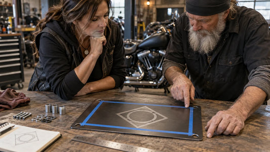
Print the design at intended finished size, tile it across sheets if necessary, and mount it temporarily at the proposed height. Use the actual outline, emblem scale, word shapes, mounting-hole locations, and edge margins. A small proportional print or zoomed screen view cannot reproduce the real angular size or wall context.
Review from the normal position first, then closer and farther away. Test representative light and check whether reflections, shadows, background texture, or low contrast obscure essential forms. Dimensional signs should also be viewed from oblique angles because raised elements can cast different shadows.

Judge hierarchy instead of chasing one formula
| Check | Question at the viewing position | Possible revision |
|---|---|---|
| Primary recognition | Is the essential emblem or name recognized first? | Increase its relative scale or reduce competition |
| Shape separation | Do small gaps and counters remain distinct? | Simplify detail or increase spacing |
| Contrast | Does foreground separate from the real wall and light? | Adjust approved color/finish combination |
| Secondary copy | Can it be read without weakening the primary mark? | Shorten, reposition, or remove it |
There is no single letter-height rule that covers every typeface, weight, color, finish, lighting condition, angle, and viewer. Treat any formula as an early estimate only. The full-size site test is the decision evidence.
Simplify while protecting authorized artwork
If the test fails, do not redraw the club emblem without authority. Ask the authorized artwork owner to approve a simplified production variant, increased spacing, or fewer secondary elements. Keep a record of which elements are fixed and which may change.

After revision, repeat the wall test; do not assume improvement. Also verify that mounting holes, borders, seams, and dimensional layers have not reduced the usable area or crowded essential forms.
Record the approved viewing conditions
Save wall photographs, measurements, viewing position, lighting notes, finished dimensions, full-size proof revision, artwork revision, approved construction and finish, sample reference, and approver. If the display moves or changes substantially, retest rather than reusing the earlier approval.
Use a simple acceptance walk-through
Ask two club reviewers to approach from the normal direction without first studying the proof. At the marked viewing position, each records what they recognize first and which approved elements remain unclear. Then inspect the sign area from the side and under the second representative lighting condition. Consolidate the observations, revise once, and repeat the same walk-through. This produces specific evidence instead of a meeting-room preference vote.
Keep subjective style approval separate from functional recognition. Reviewers may prefer different finishes, but the selected layout still needs to preserve the agreed primary hierarchy from the real position.
Frequently asked questions
What is the best letter height for a clubhouse sign?
No universal height applies. Typeface, contrast, lighting, angle, wall context, and viewer conditions require a full-size test.
Can a screen mockup prove readability?
No. Screen zoom and viewing distance do not reproduce the finished sign’s angular size, lighting, or surrounding wall.
Should every detail in the original emblem remain?
Protect the authorized artwork, but ask its owner to approve a production simplification if the full-size test shows small details closing up.
Does this method apply to safety signs?
No. Decorative club signs do not replace signs governed by building, accessibility, traffic, emergency, or safety requirements.
When should the test be repeated?
Repeat after changes to size, layout, colors, finish, lighting, construction, mounting safe area, or display position.
Request a sign measurement and sample review
Send your authorized artwork, quantities and completed measurement or sample checklist to request a design and quote review for metal signs / tin signs & wall art.
Explore Metal Signs Review Tin Signs & Wall Art
Decorative club signs are not a substitute for required safety or regulatory signage.
Tags:
Previous
Flat Tin-Style Wall Art or Dimensional Metal Club Signs?
Next
How to Plan Metal-Sign Mounting Holes Around the Club Logo
Related articles




How to Prepare a Club Decal for a Curved Surface
Sep 17 2026