
Small Text on Club Badges: Lettering and Color-Cell Checks
Quick answer: Small text on custom club badges remains clear when the longest line, narrowest stroke, smallest counter, gap and color cell are checked at finished size and then confirmed on a relevant physical sample. Start with simple letterforms, limited font variation and strong contrast. Mark uncertain details for supplier review; an enlarged screen proof cannot prove that cast, recessed or colored details will remain open.
This update keeps the existing article's useful typography principles—legibility, hierarchy, spacing, alignment, contrast and restraint—while applying them to physical motorcycle club badges. It replaces generic font-name recommendations with a proof-and-sample method tied to the actual manufacturing route.
Start with the longest text at final badge size
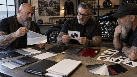
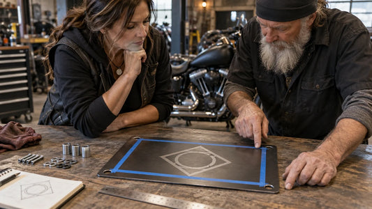
Set the exact approved wording in the proposed badge dimensions. Include capitalization and punctuation. If member names or roles vary, test the longest approved entry, not an average. Print a one-to-one proof and view it from a normal handheld distance before zooming in to diagnose a problem.
Use one primary display style and, only when necessary, one supporting style. Decorative, condensed or script-like letters can be appropriate for a large focal word, but they are a risky default for small variable information. The test is not whether the typeface looks “biker”; it is whether the essential shapes remain distinct in the offered process.

Build a lettering and color-cell check sheet
| Field | What the organizer records | What the supplier confirms |
|---|---|---|
| Finished badge size | Width, height and units | Quoted size and applicable tolerance |
| Longest text | Exact wording and location | Whether it fits the usable area |
| Narrowest stroke and gap | Marked location and measured artwork value | Whether it is suitable for the offered process |
| Smallest counter | The enclosed space inside a letter | Whether it stays open at finished size |
| Smallest color cell | Marked cell and boundary line | Whether the cell and dividing metal can be produced clearly |
| Contrast | Approved color or metal relationship | Actual process and relevant sample appearance |
Leave a supplier value blank or label it “pending confirmation” when it is not documented. Minimum letters, strokes and cells vary with construction, tooling, finish and artwork. A competitor's specification is not evidence for this product.
Simplify in a controlled order
- Remove nonessential texture behind small lettering.
- Shorten secondary wording before shrinking the primary identifier.
- Open enclosed spaces and increase gaps that appear closed at actual size.
- Reduce unnecessary font styles, outlines and shadows.
- Merge tiny color cells only with the club's approval.
- Preserve the authorized silhouette and the details the club names as essential.

Compare a simplified physical sample
Ask for a supplier-owned example made with the proposed route or an actual sample where appropriate. Inspect it under neutral light, from the front and at an angle. Check the longest line, similar letter shapes, counters, border clearance, recessed color boundaries and contrast. For color, ask the merchant to name the actual offered process. Decoration-method selection belongs with the finish decision, not the typography proof.
A useful rejection note identifies the defect and correction: “The two narrow counters close at finished size; use artwork revision B with opened counters and compare a physical sample.” It is more actionable than “make the text clearer.”

Keep a reusable approval record
Save the authorized artwork, exact text, finished dimensions, process name, measured problem locations, corrected revision, sample ID or photographs, proof version, named approver and date. For personalized badges, connect each approved text line to a unique roster row. For the wider ordering workflow, see the Custom Motorcycle Club Pins and Badges buying guide.
Frequently asked questions
Which font is best for a small club badge?
There is no universal winner. Begin with clear, open letterforms and test the exact wording at finished size in the actual offered process.
Does a vector file guarantee readable small text?
No. Vector artwork preserves clean geometry, but physical production limits and finished size still require supplier review and sample evidence.
Should small text use high contrast?
Usually, clear contrast helps, but confirm the appearance on the chosen metal and color process. A screen color does not prove a physical result.
Can the club approve only a digital proof?
A digital proof controls artwork, but it may not demonstrate cast detail, recessed boundaries or finish contrast. Request applicable real-sample evidence.
Request a lettering and sample review
Send your authorized artwork, quantities and completed measurement or sample checklist to request a design and quote review for 2d custom pins / 3d custom pins / 2d color enamel pins / 3d color pins.
Final minimums, pricing, quantity and schedule require a current supplier quote.
Tags:
Previous
Using Badges as Rewards in Events: A Guide to Boosting Engagement and Motivation
Next
Custom Motorcycle Club Gear Guide: How to Choose the Right Gear for Your Ride
Related articles
How to Prepare a Club Decal for a Curved Surface
Sep 17 2026