
How to Keep Lettering Readable on an Embroidered Back Patch
Quick answer: Keep small lettering readable on an embroidered back patch by measuring the smallest letter, thinnest stroke and narrowest gap in the final-size artwork; simplifying secondary wording; choosing clear thread-to-background contrast; and approving a physical sew-out at actual size. Do not rely on a universal minimum font size. The embroidery supplier must confirm what the chosen size, fabric, thread and digitizing plan can reproduce.
How to evaluate embroidered back patch lettering readability
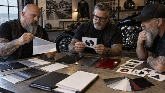
Start at the intended finished patch size. Enlarge the artwork on a monitor only to inspect construction; judge readability from a print and sew-out shown at 100 percent. Identify the primary club name or message, then separate supporting words such as a chapter, date or short descriptor. The primary line should carry the strongest visual weight. If every line competes at the same size and density, the smallest words are likely to become the weak point.
Embroidery converts shapes into stitches. Thin strokes can gain visual weight, tight counters can close, and narrow gaps can fill when thread, base fabric and stitch direction interact. Those effects depend on the actual production setup. This is why a generic “minimum letter height” copied from another supplier cannot approve your design.
Keep this decision distinct from rocker arc fitting. Curved text introduces a separate geometry problem. For center or back-patch ordering choices, consult the Custom Back Patches and Rockers buying guide.
Record letter height, stroke, gaps and contrast
Prepare a final-size print of the authorized artwork. Add a small measurement table rather than covering the art with crowded notes:
| Check | How to record it | Why it matters |
|---|---|---|
| Smallest letter height | Measure cap height or the visible letter body, state the unit, and identify the exact line | Locates the most size-sensitive wording |
| Thinnest stroke | Measure the narrowest intended mark on the final-size art | Helps the supplier evaluate stitch representation |
| Narrowest gap or counter | Measure between adjacent strokes and inside enclosed shapes | Highlights places that may visually close |
| Thread/background contrast | Record the proposed thread reference and base color, then review a physical sample in neutral light | Separates geometric readability from color selection |

Measurements describe the submitted design; they do not guarantee that the design is producible. Leave supplier-specific limits open until the supplier has reviewed the file and production method. Record any required change as a new artwork revision rather than silently replacing the original.
Separate the primary name from supporting words
Protect the main identity first. If the supporting line is crowded, consider shortening authorized wording, removing decorative outlines around the smallest text, increasing space between letters, or moving secondary information to another approved component. Do not invent abbreviations or remove meaningful words without the artwork owner’s approval.
Choose letterforms for open shapes, clear stroke rhythm and adequate separation. Highly condensed, heavily distressed or excessively ornate forms can make a difficult line harder to stitch. Avoid stretching a typeface solely to fill space. A simplified artwork revision should preserve the authorized identity while making the physical construction less ambiguous.
Contrast should be evaluated on the actual thread and base sample, not only with digital color values. Two colors that look different on a bright screen can merge under ordinary light. Conversely, an outline may improve separation but also consume space around already-small forms. Treat color, outline and scale as one proof decision.

Approve the hardest-to-read section before the full order
Ask for a digitized proof and, when appropriate to the merchant’s current sample process, an actual stitch-out. Inspect the smallest line, narrowest counter, tightest pair of letters and any outline around the wording. Look for shapes that merge, uneven spacing, lost punctuation, rough edges or thread choices that reduce contrast.
Review the sample under neutral indoor light and ordinary daylight. Place it at the distance from which a back patch is normally viewed. A macro photograph can reveal stitch construction, but it should not substitute for the normal-distance check. The test is whether authorized wording remains recognizable without guessing.
A corrected example might begin with a secondary line that looks clear on the screen but closes in the sew-out. The designer removes an unnecessary decorative outline, increases the spacing and supplies revision C. The next sew-out is accepted only after the named approver can read the same line at actual size and ordinary viewing distance.

Save the approved readability record
Store the smallest letter height, stroke and gap measurements with units; thread and background references; final patch dimensions; authorized artwork revision; digitized proof; physical sample or sew-out ID; supplier comments; approver; and approval date. Photograph the accepted sample beside the final-size artwork and a scale.
This record gives a reorder a reliable starting point, but it is not permission to skip confirmation. A different size, base fabric, thread, edge or supplier can change the result. Ask what must be re-sampled whenever a production variable changes.
Send the completed checks for a custom-order review
Send the authorized original artwork and final-size revision, intended finished dimensions, quantity, smallest letter height, thinnest stroke, narrowest gap, proposed thread/background contrast and the hardest-to-read line. Ask for current requirements for dimensioned artwork, full-size templates, digitized proof, actual stitch-out, thread references, edge and backing specifications, sample approval and artwork authorization.
Use the current Custom Back Patches page to request the product-specific review. If the wording belongs on a separate curved component, review Top & Bottom Rockers and provide its arc evidence separately.
Request an Embroidered Back-Patch Readability Review
CTA: Send your authorized artwork, quantities and completed measurement or sample checklist to request a design and quote review for custom back patches.
Frequently asked questions
What is the minimum letter size for an embroidered back patch?
There is no universal number that can approve every design. Finished size, letterform, stroke, gaps, thread, base and digitizing all matter. Ask the actual supplier to confirm the final-size design through its proof and sample process.
Why can small embroidered letters close up?
Thread and stitch paths add physical width. Tight counters or gaps that appear open in digital art can lose separation in the sew-out.
Should I choose a bold font for patch readability?
Choose clear, open letterforms with adequate spacing. More weight can help in some designs, but overly heavy letters can close counters, so confirm the result in a physical sew-out.
How should I compare artwork with a sew-out?
Print the artwork at final size, place it beside the sample, and inspect the smallest line, narrowest gaps, outlines and contrast. Also view the sample from normal vest-viewing distance.
What records should be saved for a patch reorder?
Save the approved artwork revision, final dimensions, letter/stroke/gap measurements, thread and base references, digitized proof, sample ID, approver and date.
Tags:
Previous
How to Align Club Artwork Around a Lighter Lid Seam
Next
How to Fit Long Chapter Text Into a Curved Rocker
Related articles
How to Prepare a Club Decal for a Curved Surface
Sep 17 2026